This is a small tutorial on how to annotate custom ggplot charts. GGPLOT2 includes shadowed boxes, arrows and text to highlight specific data points in charts, helping to drive the story telling, communicating meaningful information using plots and visualization elements in R.
1. Download A&E data
The plot we will build and annotate will use NHS England A&E England Attendances data. We choose to download England Time Series data available from NHS England Statistics section main website.
1.1 NHS England A&E Attendances and Emergency Admissions data
We use GET() function from {httr} library to download A&E data from NHS England URL
The Weekly and Monthly A&E Attendances and Emergency Admissions collection collects the total number of attendances in the specified period for all A&E types, including Urgent Treatment Centres, Minor Injury Units and Walk-in Centres, and of these, the number discharged, admitted or transferred within four hours of arrival.
1.2 Download tidy A&E data
We can make use of the {janitor} package to download A&E data and to obtain column names that ease further daat manipulation
Code
library(httr)# CLEAN DATA SET# Cleaned data set with all variable as Integersurl1<-'https://www.england.nhs.uk/statistics/wp-content/uploads/sites/2/2023/10/Monthly-AE-Time-Series-September-2023.xls'GET(url1, write_disk(tf <-tempfile(fileext =".xls")))
Check start and end period of this A&E Time series data:
[1] "2010-11-01 UTC"
[1] "2023-09-01 UTC"
This data set from NHS England, includes includes England Time Series data for Type 1, Type 2 and Type 3 Attendances covering the period that starts on 2010-11-01 and ends on 2023-09-01 as we can see in the table below:
2. Present tables using GT package
The gt package is all about making it simple to produce nice-looking display tables. We can use it to improve how we present the previous table:
First we will filter the original data set to include just 2023 data
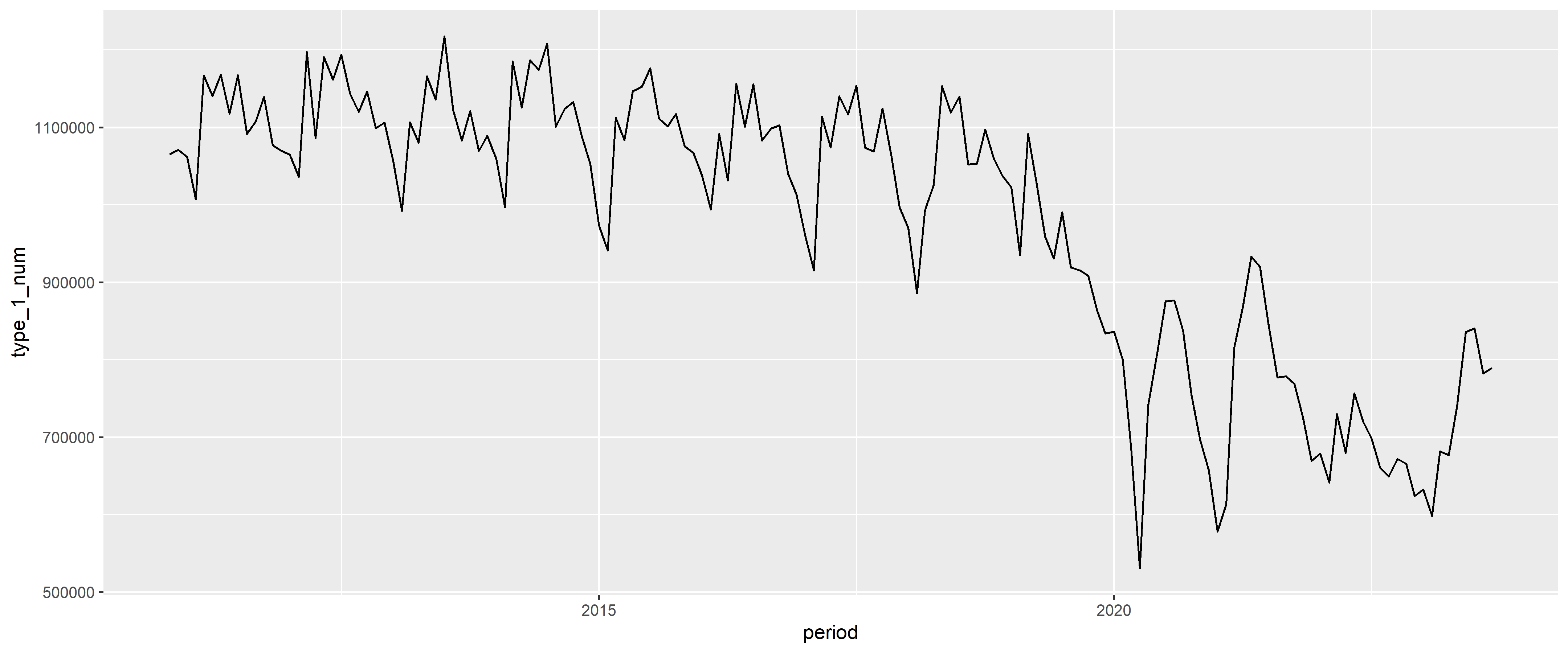
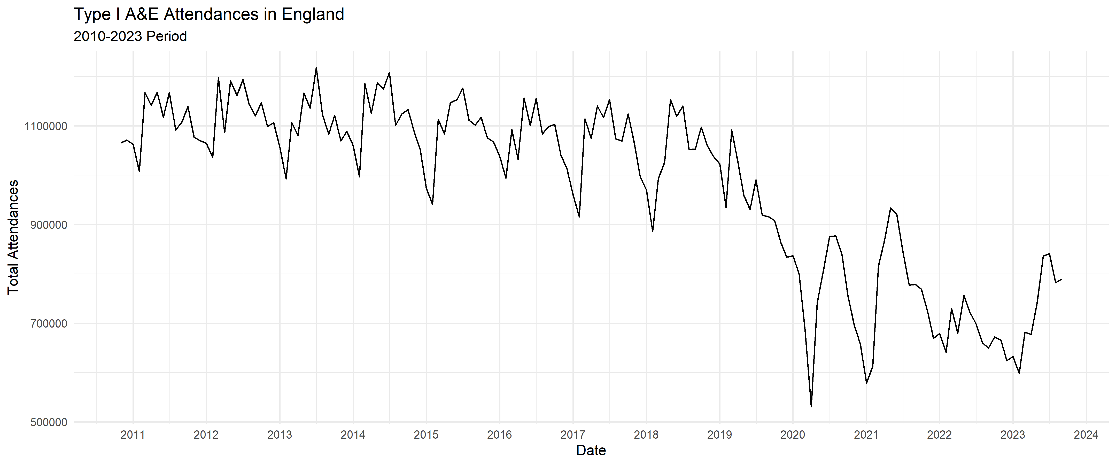
We start by building a bare minimum ggplot2 line chart. This basic line chart includes ggplot2() function with aes() argument including x and y variables, and the geom.
There are four main parts of a basic ggplot2 visualization: the ggplot() function, the data parameter, the aes() function, and the geom. Get an accurate description from each of these elements from: https://www.sharpsightlabs.com/blog/ggplot2-tutorial/
The ggplot function The ggplot() function is the core function of ggplot2. It initiates plotting.
There are 14 years of data in the original data set.
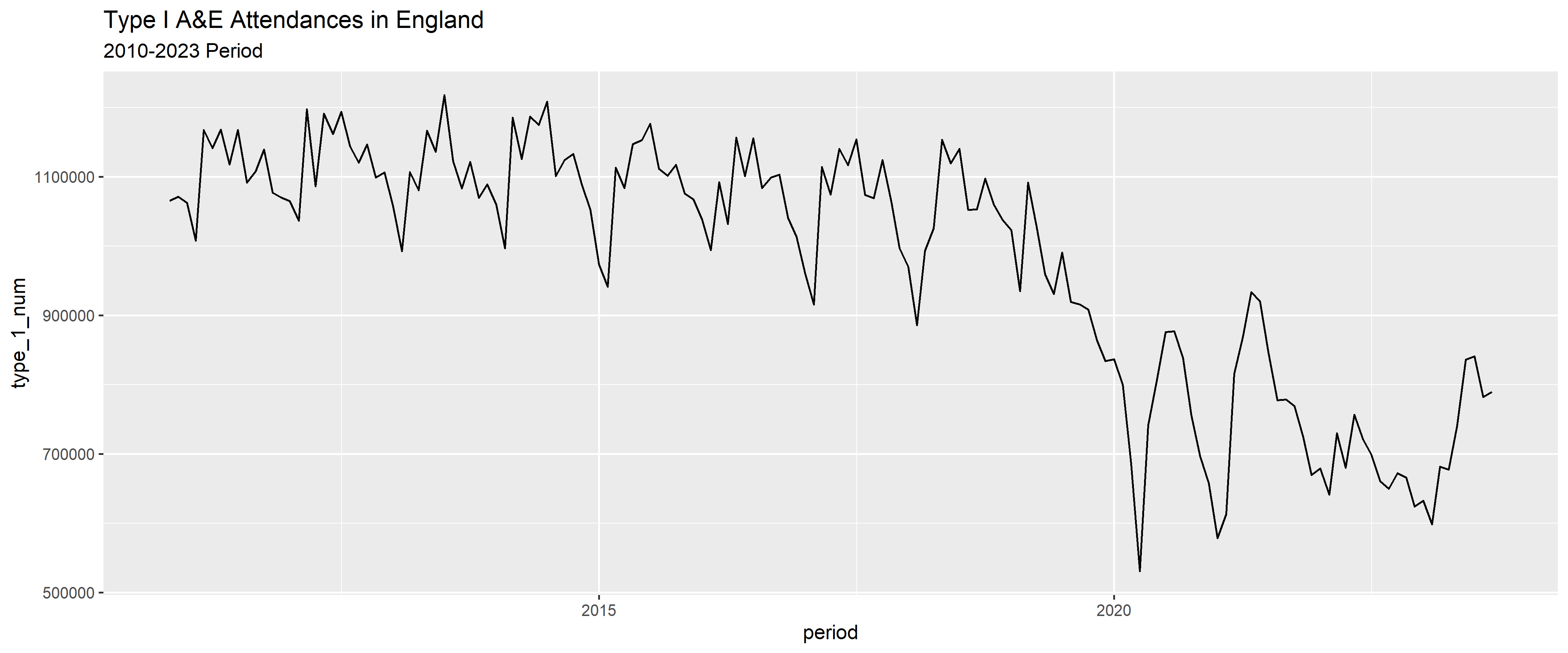
In the chart below, we can see the X axis only displays two years out of the 14 available in the data set. The way to fix it is by using scale_x_data() function defining labels as years ‘%Y’ with date_breaks defined as ‘1 year’ so X axis will display every single year in the data set.
Code
Basic_plot_format <-ggplot(data = TypeI_date_format, aes(x = Datef, y = type_1_num)) +geom_line() +labs(title ="Type I A&E Attendances in England",subtitle ="2010-2023 Period",x ="Date",y ="Total Attendances") +scale_x_date(date_labels="%Y",date_breaks ="1 year") Basic_plot_format
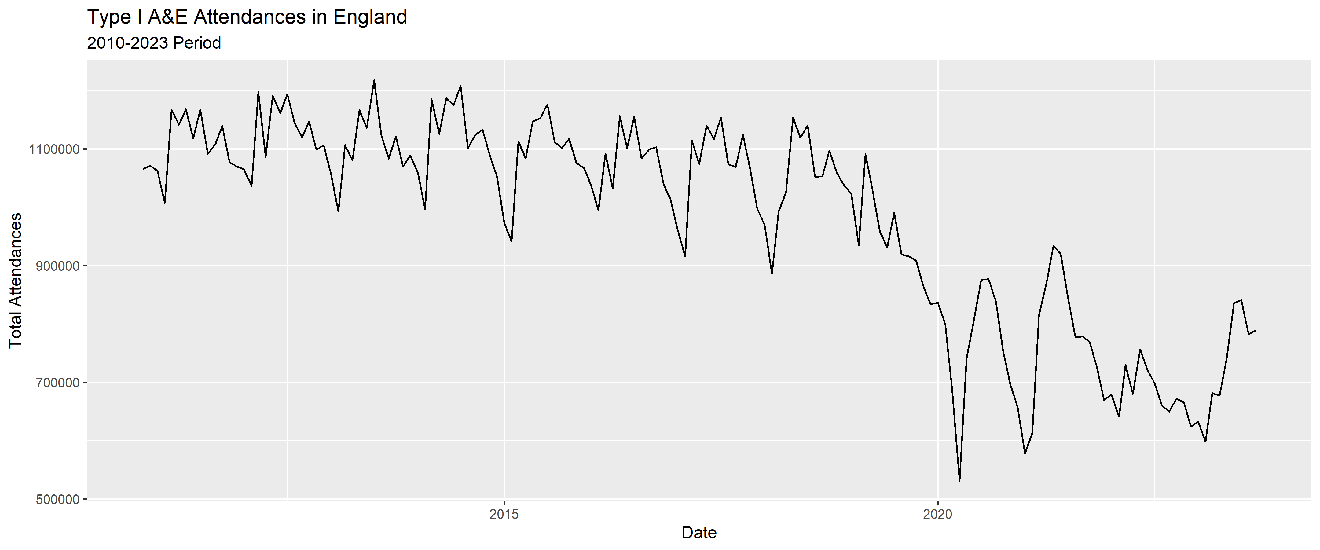
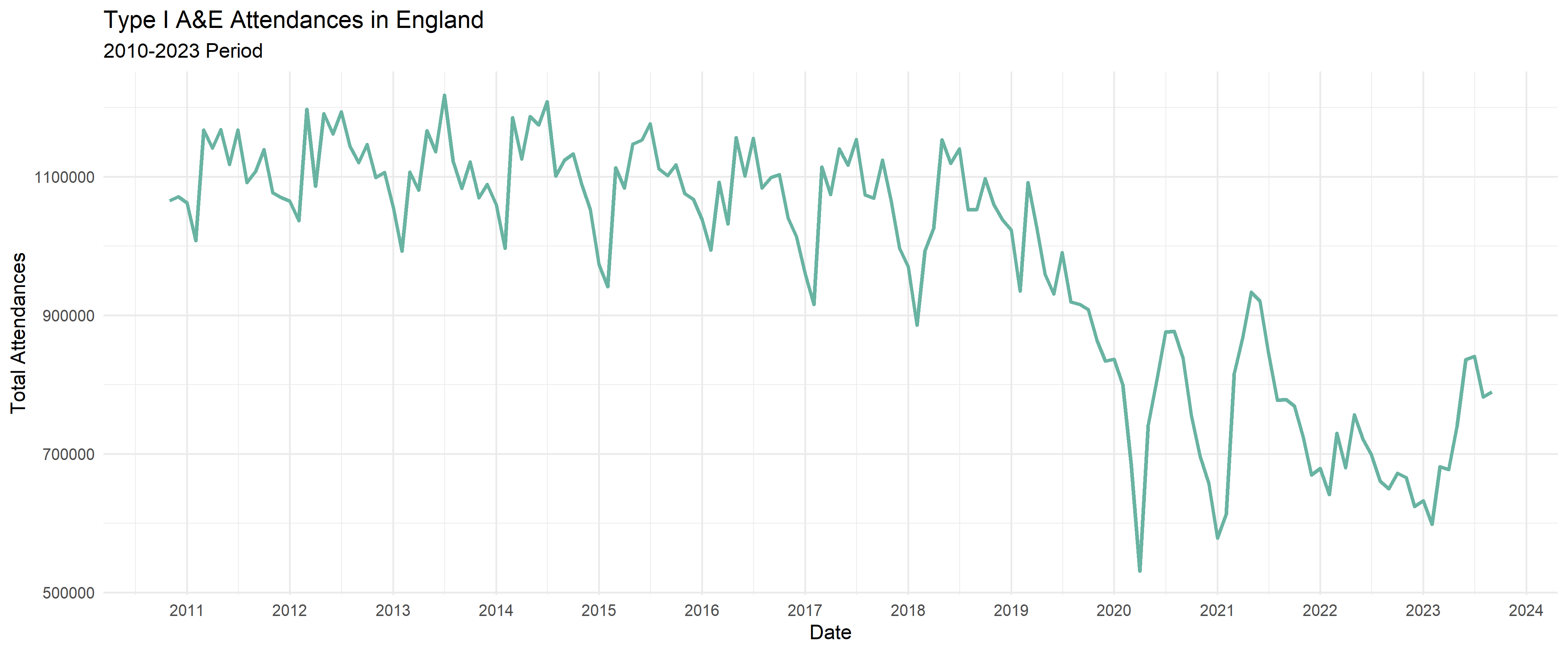
4.5 Apply theme to the plot
We can apply defined theme() setup to the chart. There are several to choose from:(theme_bw(), theme_dark(), them_grey(), theme_light(), theme_minimal(), theme_classic() ) . I will choose theme_minimal() as this will provide a lower inks ratio outcome.
We apply then theme_minimal() to the existing ggplot chart
Code
Basic_plot_format <-ggplot(data = TypeI_date_format, aes(x = Datef, y = type_1_num)) +geom_line() +labs(title ="Type I A&E Attendances in England",subtitle ="2010-2023 Period",x ="Date",y ="Total Attendances") +scale_x_date(date_labels="%Y",date_breaks ="1 year") +theme_minimal()Basic_plot_format
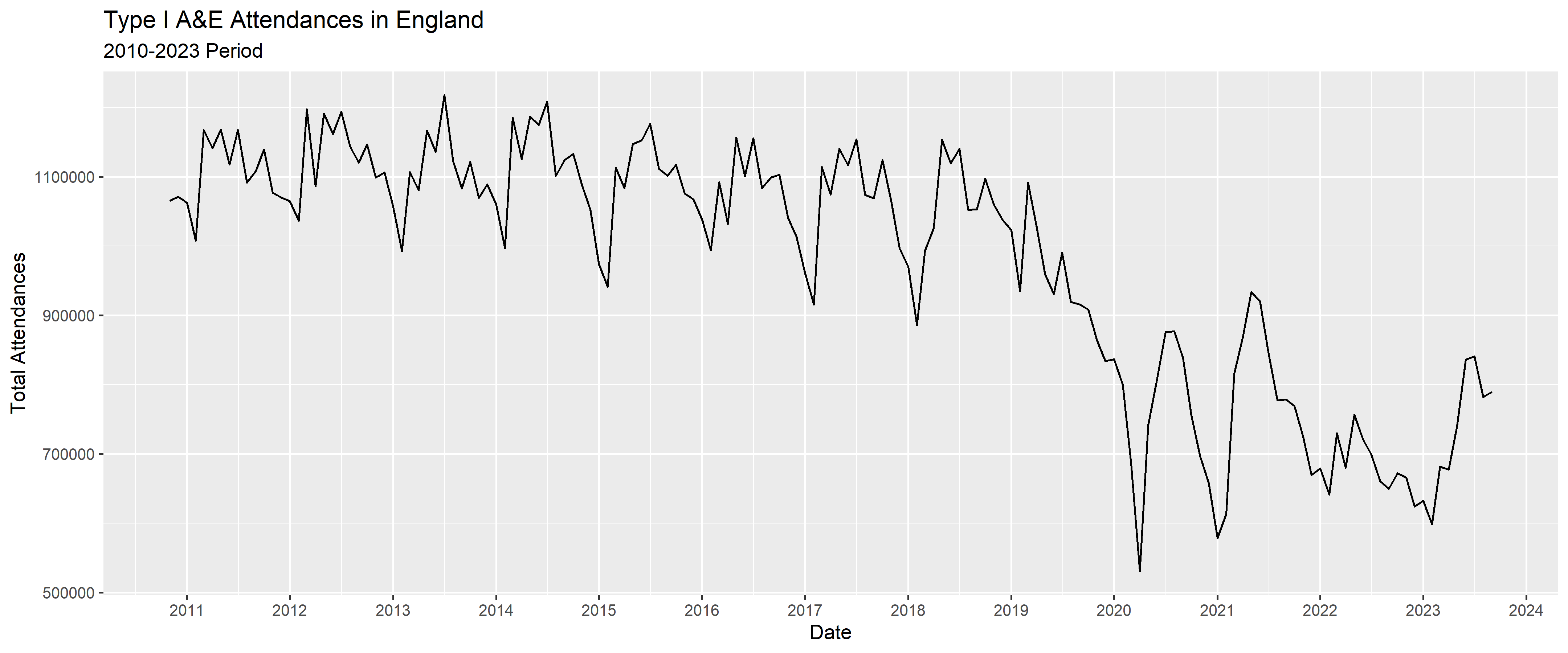
4.6 Finally we apply colour to the line chart
We apply inside geom_line() function two parameters colour to add colour to the existing line and also we include size parameter equal to 1 to increase the size of the line used in the chart:
Code
Basic_plot_format <-ggplot(data = TypeI_date_format, aes(x = Datef, y = type_1_num)) +geom_line(color="#69b3a2", size =1) +labs(title ="Type I A&E Attendances in England",subtitle ="2010-2023 Period",x ="Date",y ="Total Attendances") +scale_x_date(date_labels="%Y",date_breaks ="1 year") +theme_minimal()Basic_plot_format
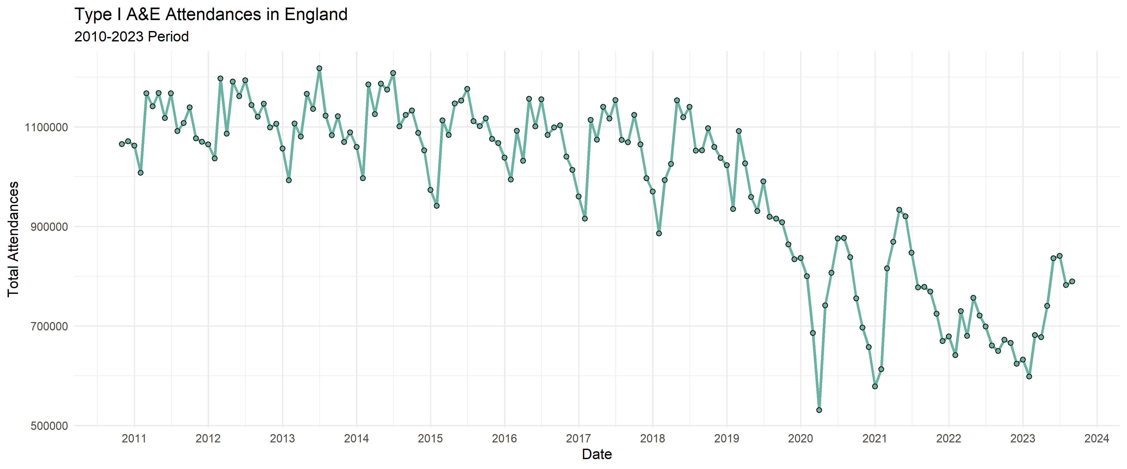
Then we can save this plot as an initial basic chart
The next step will include several annotations to the chart to help the storytelling part when using this chart.
5.1 Using annotate() function
From {ggplot2} package we use the annotate() function to create an annotation layer in the chart. This function is highly versatile as it allows us to include both text and geoms such as lines and arrows.
We then only require one extra function geom_segment() also from ggplot2 to draw straight vertical or horizontal reference lines in the chart area.
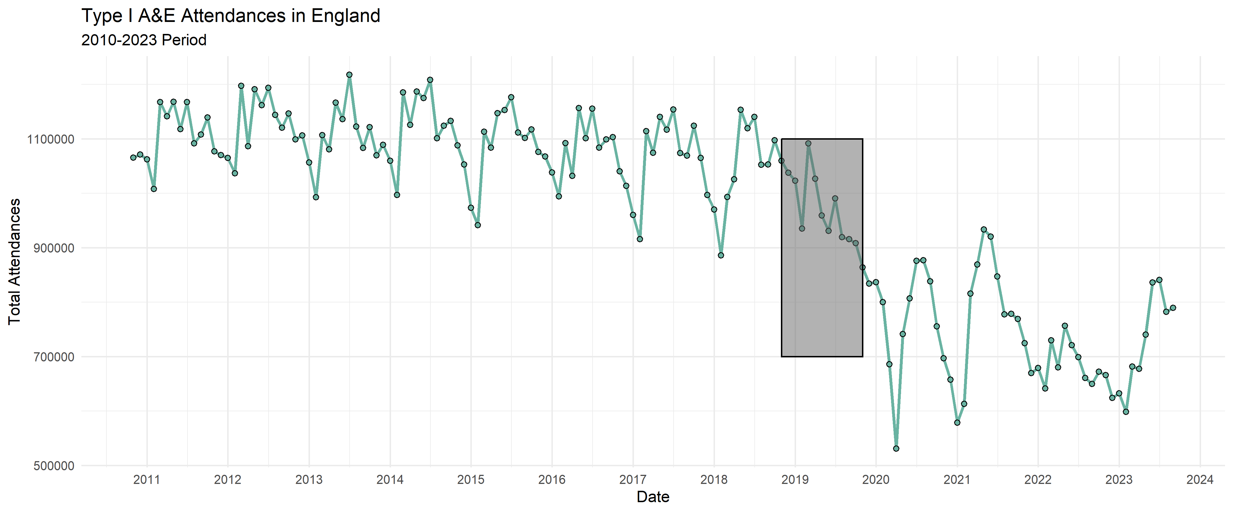
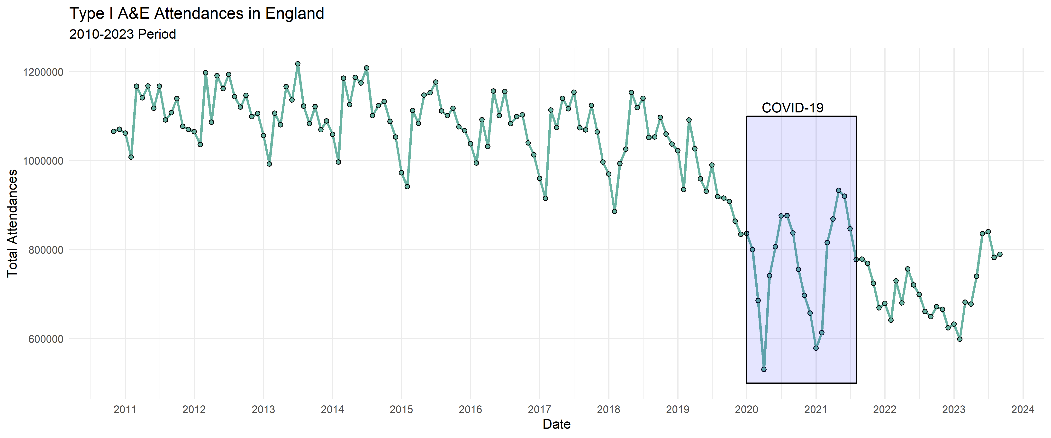
5.1.1 Adding rectangle annotation
We can start by adding a rectangle to the previous chart
We can start by adding a rectangle to the previous chart Adding a text annotation:
COVID pandemic
COVID-19 was confirmed to be present in the UK by the end of January 2020
A legally-enforced Stay at Home Order, or lockdown, was introduced on 23 March 2021, banning all non-essential travel and contact with other people, and shut schools, businesses, venues and gathering places.
A third wave of daily infections began in July 2021 due to the arrival and rapid spread of the highly transmissible SARS-CoV-2 Delta variant.[62]
So we can establish the COVID-19 pandemic period roughly from 01 January 2020 to 01 August 2021
Code
Basic_plot_format <-ggplot(data = TypeI_date_format, aes(x = Datef, y = type_1_num)) +geom_line(color="#69b3a2", size =1) +geom_point(shape=21, color="black", fill="#69b3a2", size=1.5) +labs(title ="Type I A&E Attendances in England",subtitle ="2010-2023 Period",x ="Date",y ="Total Attendances") +scale_x_date(date_labels="%Y",date_breaks ="1 year") +theme_minimal() +annotate('rect',xmin =as.Date("2020-01-01"), xmax =as.Date("2021-08-01"),ymin =500000, ymax =1100000, alpha =0.1 , fill ='blue',col ='black') +annotate('text',x =as.Date("2020-09-01"),y =1120000,label ="COVID-19")Basic_plot_format
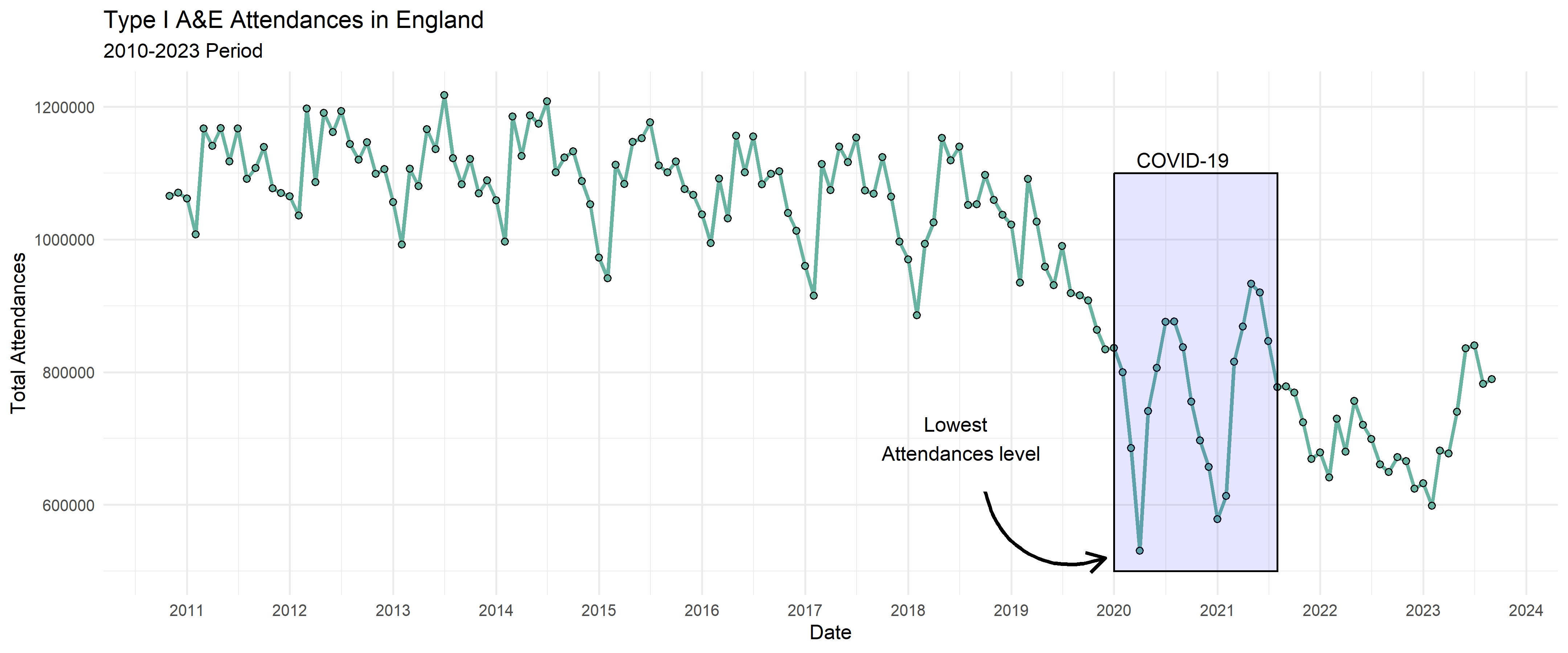
5.1.3 Adding arrows to highlight single values
We can also add a curved line with an arrow at the end pointing to specific values. We need to include the arrow function to the curve annotation created earlier: arrow = arrow(length = unit(0.4,'cm')))
Note that the annotate() function is a good alternative that can reduces the code length for simple cases.
6. Annotated ggplot chart including Arrows and rectangles
This would be the annotated chart including shadowed rectangle are and an arrow with text to highlight specific data points in the plot area.
Code
Curved_line_annotation <-ggplot(data = TypeI_date_format, aes(x = Datef, y = type_1_num)) +geom_line(color="#69b3a2", size =1) +geom_point(shape=21, color="black", fill="#69b3a2", size=1.5) +labs(title ="Type I A&E Attendances in England",subtitle ="2010-2023 Period",x ="Date",y ="Total Attendances") +scale_x_date(date_labels="%Y",date_breaks ="1 year") +theme_minimal() +annotate('rect',xmin =as.Date("2020-01-01"), xmax =as.Date("2021-08-01"),ymin =500000, ymax =1100000, alpha =0.1 , fill ='blue',col ='black') +annotate('text',x =as.Date("2020-09-01"),y =1120000,label ="COVID-19") +annotate('curve',x =as.Date("2018-10-01"),xend =as.Date("2019-12-01"),y =620000,yend =520000,linewidth =1, curvature =0.5,# Adding an Arrow to my curvaturearrow =arrow(length =unit(0.4,'cm'))) +annotate('text',x =as.Date("2018-06-27"),y =700000,label ="Lowest \n Attendances level")Curved_line_annotation
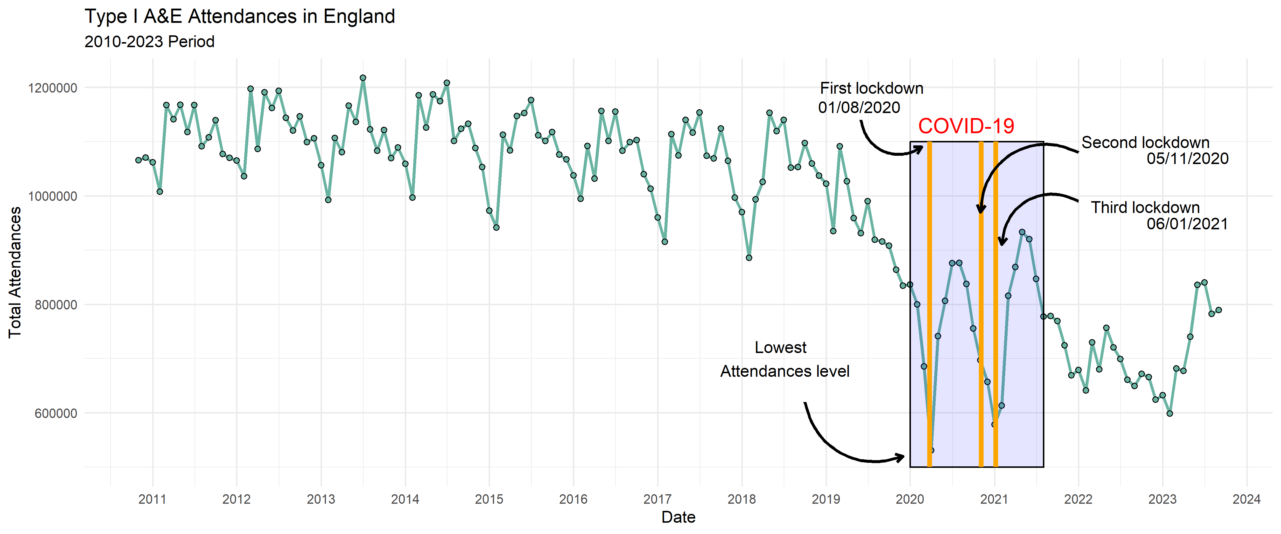
In this new section we will include three vertical lines for each of the lock downs, the functions below can also be used to draw horizontal reference lines.
Set of geoms used in charts to annotate different sections:
rectangle: when annotate() argument takes ‘react’ value. This displays a rectable in the GGPLOT chart defined by x and Y coordinates, and also color and transparency argument (alpha).
text: when annotate() argument takes ‘text’ value. This argument displays a text in the chart. Text content defined by label argument, and color, text position in the chart defined by x and y coordinates.
geom_segment: geom_segment will only draw between specific end points. It helps to make a data frame with the relevant information for drawing the lines.
Curved_line_annotation <-ggplot(data = TypeI_date_format, aes(x = Datef, y = type_1_num)) +geom_line(color="#69b3a2", size =1) +geom_point(shape=21, color="black", fill="#69b3a2", size=1.5) +labs(title ="Type I A&E Attendances in England",subtitle ="2010-2023 Period",x ="Date",y ="Total Attendances") +scale_x_date(date_labels="%Y",date_breaks ="1 year") +theme_minimal() +annotate('rect',xmin =as.Date("2020-01-01"), xmax =as.Date("2021-08-01"),ymin =500000, ymax =1100000, alpha =0.1 , fill ='blue',col ='black') +annotate('text',x =as.Date("2020-09-01"),y =1130000,label ="COVID-19", color="red",size =5) +annotate('curve',x =as.Date("2018-10-01"),xend =as.Date("2019-12-01"),y =620000,yend =520000,linewidth =1, curvature =0.5,# Adding an Arrow to my curvaturearrow =arrow(length =unit(0.2,'cm'))) +annotate('text',x =as.Date("2018-06-27"),y =700000,label ="Lowest \n Attendances level") +#ADD LOCKDOWN DATES REFERENCE LINES# Replacing vline by geom_segment (it allows controlling for reference lines lenght)# First lockdown 26 March 2020geom_segment(aes(x =as.Date("2020-03-26"), y =500000, yend =1100000,xend =as.Date("2020-03-26"), colour ="segment"),linewidth=1.5,color="orange") +# Second Lockdown 5 November 2020geom_segment(aes(x =as.Date("2020-11-05"), y =500000, yend =1100000,xend =as.Date("2020-11-05"), colour ="segment"),linewidth=1.5,color="orange") +# Third lockdown 6 January 2021geom_segment(aes(x =as.Date("2021-01-06"), y =500000, yend =1100000,xend =as.Date("2021-01-06"), colour ="segment"),linewidth=1.5,color="orange") +# Text annotations for each lockdownannotate('text',x =as.Date("2019-07-20"),y =1200000,label ="First lockdown") +annotate('text',x =as.Date("2019-05-26"),y =1164000,label ="01/08/2020") +annotate('text',x =as.Date("2022-10-20"),y =1100000,label ="Second lockdown") +annotate('text',x =as.Date("2023-04-20"),y =1070000,label ="05/11/2020") +annotate('text',x =as.Date("2022-10-20"),y =980000,label ="Third lockdown") +annotate('text',x =as.Date("2023-04-20"),y =950000,label ="06/01/2021") +# Adding arrows to lockdowns labels # First lockdown arrow annotate('curve',x =as.Date("2019-06-01"),xend =as.Date("2020-02-20"),y =1140000,yend =1090000,linewidth =1,curvature =0.6,arrow =arrow(length =unit(0.2,'cm'))) +# Second lockdown arrowannotate('curve',x =as.Date("2022-01-01"),xend =as.Date("2020-11-01"),y =1080000,yend =970000,linewidth =1,curvature =0.6,arrow =arrow(length =unit(0.2,'cm'))) +# Third lockdown arrowannotate('curve',x =as.Date("2022-01-01"),xend =as.Date("2021-02-01"),y =990000,yend =910000,linewidth =1,curvature =0.6,arrow =arrow(length =unit(0.2,'cm'))) Curved_line_annotation
7.1 List of lockdown relevant dates:
First national lockdown (March to June 2020)
England was in national lockdown between late March and June 2020. Lockdown measures legally came into force for the first time on 26 March 2020.
First nationwide lockdown was legally effective from 1:00pm on 26th March 2020.
Initially, all “non-essential” high street businesses were closed and people were ordered to stay at home, permitted to leave for essential purposes only, such as buying food or for medical reasons. Starting in May 2020, the laws were slowly relaxed. People were permitted to leave home for outdoor recreation (beyond exercise) from 13 May. On 1 June, the restriction on leaving home was replaced with a requirement to be home overnight, and people were permitted to meet outside in groups of up to six people.
Second national lockdown (November 2020)
On 5 November 2020, national restrictions were reintroduced in England. During the second national lockdown, non-essential high street businesses were closed, and people were prohibited from meeting those not in their “support bubble” inside. People could leave home to meet one person from outside their support bubble outdoors.
Third national lockdown (January to March 2021)
Following concerns that the four-tier system was not containing the spread of the Alpha variant, national restrictions were reintroduced for a third time on 6 January 2021.
The rules during the third lockdown were more like those in the first lockdown. People were once again told to stay at home. However, people could still form support bubbles (if eligible) and some gatherings were exempted from the gatherings ban (for example, religious services and some small weddings were permitted).